A run chart tracks changes to a variable over time. It is similar to a control chart, but the run chart does not show the upper and lower limits. A run chart can help viewers see potential trends.
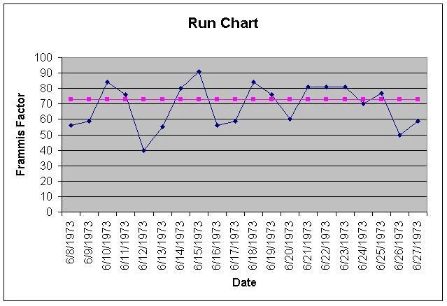
Example of a simple run chart. (From Wikipedia, created by Craig K Bryant, who released it to public domain.)
Related: quality control measurements, control chart
Run charts are also known as run-sequence plots.
Cautions[]
When a run chart shows too short a timeframe, it can be misleading. For instance, a chart showing a nighttime low temperatures for two months during the fall would make it look like there was an ongoing cooling.
The range on the Y axis (usually the vertical one showing the measurements of the variable) can be trimmed in a way that is misleading. A variable that ranges between 40-50% can look wild, if the Y-axis only shows from 40-50, but if it shows 0-100%, the viewer can see that the variance is staying within a limited range.
External links[]
- Wikipedia's article on run chart